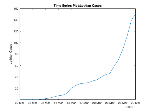
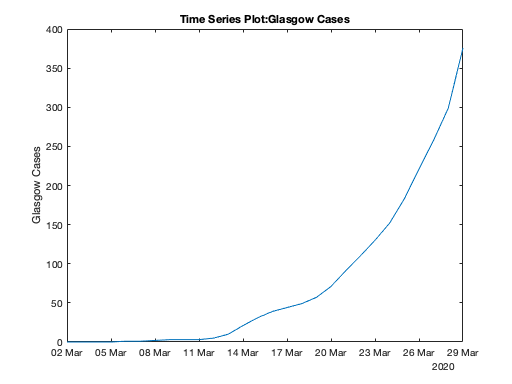
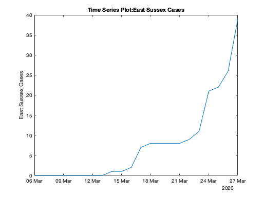
Here in Scotland (and in England) the governments publish coronavirus data daily. But they do not show the data in a particularly useful way as it is simply a count of cases confirmed so far. These counts are useful as they can show whether the health service is likely to cope with the outbreak or not today, but they do not show the history of the pandemic.

I believe the important information is to see a graph of the confirmed cases to allow you to judge if the wanted flattening of the curve is happening or not. This curve is explained here by Scotland’s National Clinical Director, Jason Leitch. Also what matters to most people is what is happening locally to themselves and their loved ones.
So I’ve knocked together a MATLAB script to plot some graphs for the Lothian Health Board and the Greater Glasgow and Clyde Health Board in Scotland and the East Sussex Healthcare NHS Trust in England. The script gets its data from Tom White’s GitHub page. As Tom says, this data should be made available officially but does not appear to be published yet in a usable format. Thanks for the data, Tom!
I’m not a MATLAB guru and I’m sure my script could be written better and be more robust. But it works for me. Here is the code. MATLAB is quite expensive (I use it for playing about with radios and electronics) but the script could probably be rewritten in Octave with something replacing the TimeSeries variables. Spreadsheets would work too but I’m even less a guru in them than MATLAB.
And the grim results, no doubt to become much grimmer due to the expected exponential growth of cases. Early days yet.


