The graphs in my previous posts use data which is getting more and more complicated to understand. The governments are now presenting the data much better so I’ve decided to stop updating the graphs so often.
Try these links instead:
Things made with bits and soldering irons

The graphs in my previous posts use data which is getting more and more complicated to understand. The governments are now presenting the data much better so I’ve decided to stop updating the graphs so often.
Try these links instead:

I thought it might be educational to compare the different health services within the UK with regard to how many COVID-19 deaths there have been, adjusted for population. Here is the result. The figures are the numbers of deaths per million population.
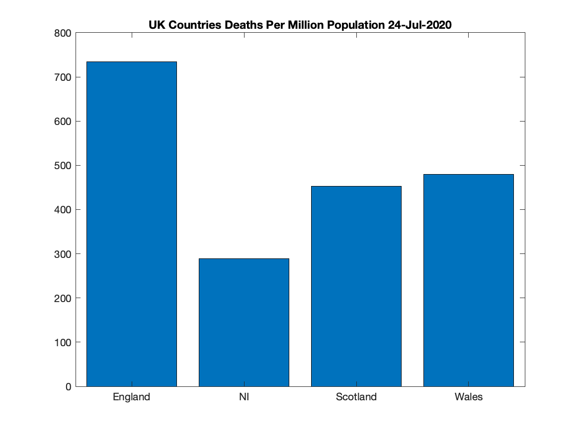
Of course, each country counts deaths in its own way, so beware of how you interpret this.
The English and Scottish figures cover deaths in hospitals only and do not count deaths in care homes or people dying at home. (As at Thursday, 16 April 2020 this means the used values are 25-30% low). I believe the same is true for NI and Wales. However, it doesn’t look like the differences between the various countries would be much affected by the uncounted deaths.
The MATLAB code is here.

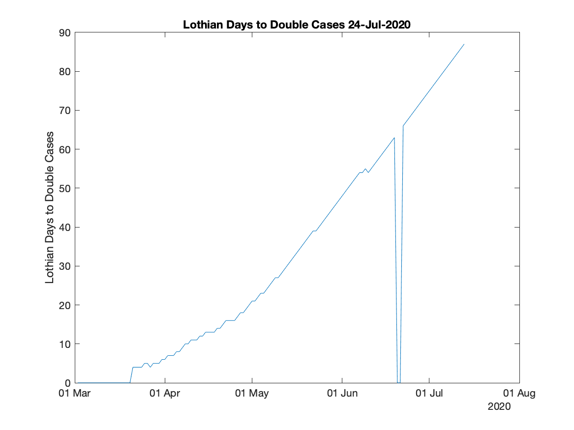
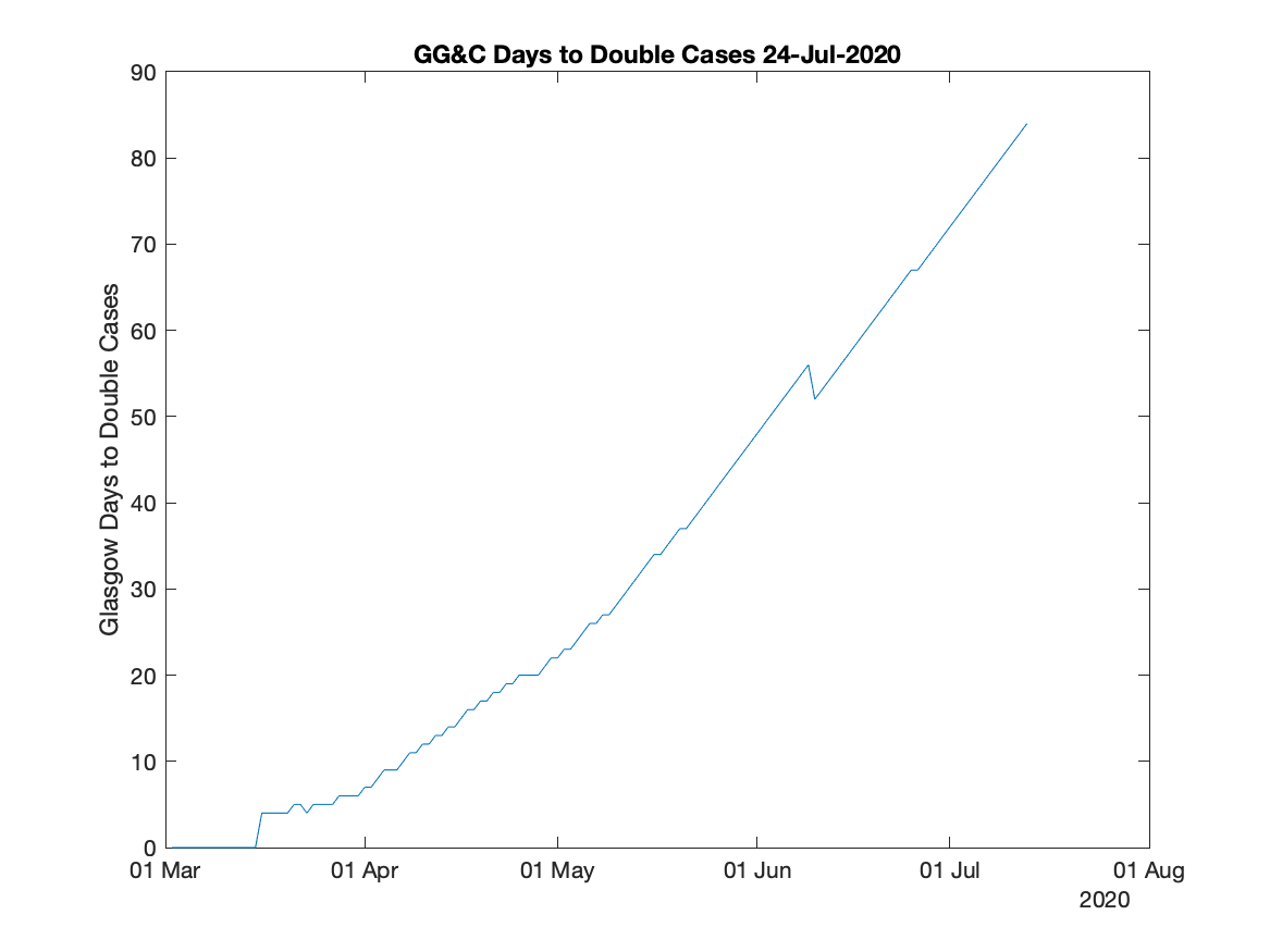
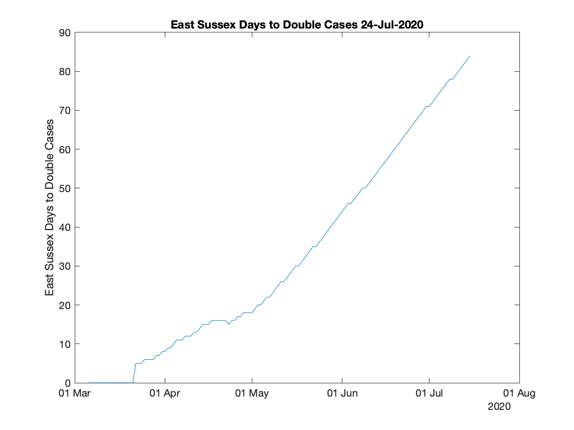
I’ve added some graphs to the coronavirus cases graphs I mentioned earlier. These graphs plot how many days it takes for cases to double. So the higher the number the better.
When the peak of the cases has been reached the graphs show the number of days for the cases to halve. It does this by showing the days as negative numbers.
I suspect that at the peak the graph will jitter quite a lot.
I’ve suppressed the figures for the first 100 cases as the figures probably wouldn’t make any sense. Suppressed figures are set to zero.
Of course, as the governments change how they test cases the graphs will be harder to interpret.
Anyway, here’s the latest graphs.
The MATLAB code is here.

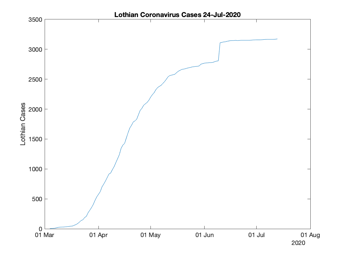
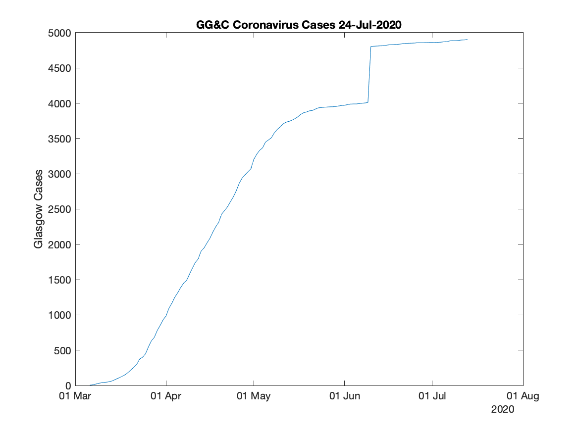
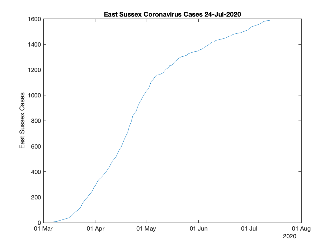
My earlier post ‘Plotting Local Coronavirus Cases’ shows one way of plotting graphs of coronavirus cases.
The latest graphs I’ve made are below.
BTW, the Scottish Parliament Information Centre now publish various good charts. They say to use Google Chrome but the charts seem to work fine in Apple Safari. YMMV.
The MATLAB code is here.

Here in Scotland (and in England) the governments publish coronavirus data daily. But they do not show the data in a particularly useful way as it is simply a count of cases confirmed so far. These counts are useful as they can show whether the health service is likely to cope with the outbreak or not today, but they do not show the history of the pandemic.

I believe the important information is to see a graph of the confirmed cases to allow you to judge if the wanted flattening of the curve is happening or not. This curve is explained here by Scotland’s National Clinical Director, Jason Leitch. Also what matters to most people is what is happening locally to themselves and their loved ones.
So I’ve knocked together a MATLAB script to plot some graphs for the Lothian Health Board and the Greater Glasgow and Clyde Health Board in Scotland and the East Sussex Healthcare NHS Trust in England. The script gets its data from Tom White’s GitHub page. As Tom says, this data should be made available officially but does not appear to be published yet in a usable format. Thanks for the data, Tom!
I’m not a MATLAB guru and I’m sure my script could be written better and be more robust. But it works for me. Here is the code. MATLAB is quite expensive (I use it for playing about with radios and electronics) but the script could probably be rewritten in Octave with something replacing the TimeSeries variables. Spreadsheets would work too but I’m even less a guru in them than MATLAB.
And the grim results, no doubt to become much grimmer due to the expected exponential growth of cases. Early days yet.


