
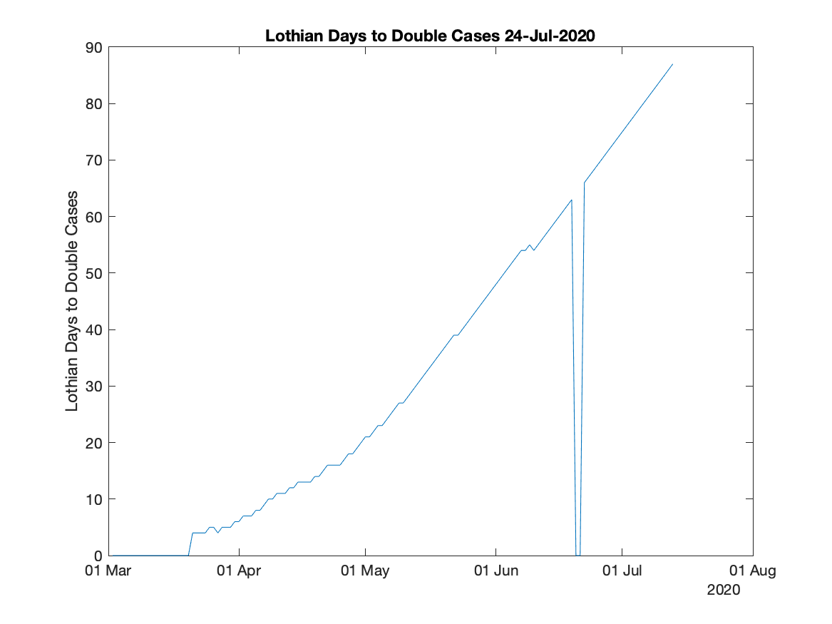
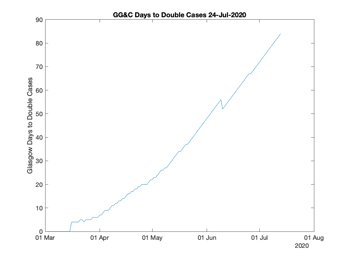
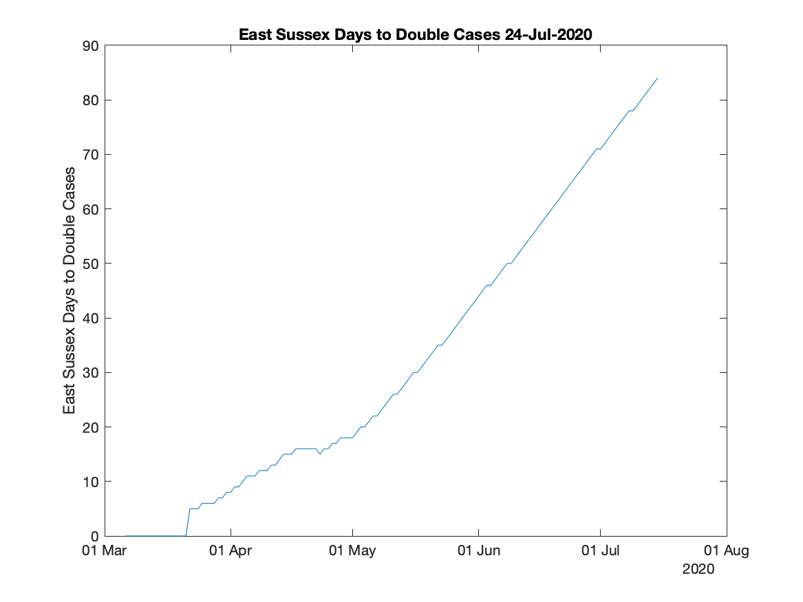
I’ve added some graphs to the coronavirus cases graphs I mentioned earlier. These graphs plot how many days it takes for cases to double. So the higher the number the better.
When the peak of the cases has been reached the graphs show the number of days for the cases to halve. It does this by showing the days as negative numbers.
I suspect that at the peak the graph will jitter quite a lot.
I’ve suppressed the figures for the first 100 cases as the figures probably wouldn’t make any sense. Suppressed figures are set to zero.
Of course, as the governments change how they test cases the graphs will be harder to interpret.
Anyway, here’s the latest graphs.
The MATLAB code is here.