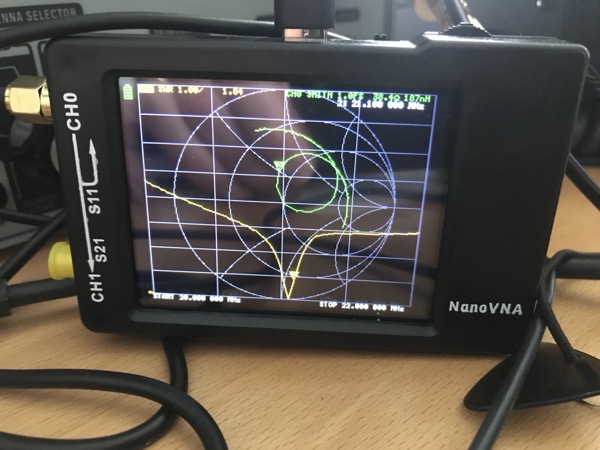
The nanoVNA is a cheap but usable vector network analyser. It is good value and very useful for all sorts of RF design and radio ham activities. I suggest you buy a nanoVNA from a reputable dealer as there are plenty of clones which don’t work as well as the original. The model I have has a tiny screen which I can read adequately but it isn’t as comfortable as reading a computer screen. The NanoVNA is a touchscreen device so you need to tap on tiny text to do anything. Again, this is possible but far from comfortable for those of us with ageing eyes. There’s also a bit of screen reflection.
The nanoVNA can be driven from a PC using a program called nanoVNA-saver which is pretty good. Unfortunately it runs on Microsoft Windows and as I don’t have a PC running Microsoft Windows I have to run it in a VirtualBox VM on my Mac Mini. This works but is a bit clunky and to be honest my Mac mini is a bit long in the tooth and struggles to run virtualised Windows 10 at a reasonable speed.
There is a cross-platform solution based on Python which looks promising. It uses Homebrew on MacOS which clashes with MacPorts which I use. I tried to make it work under MacPorts but fell into the usual maze of incompatible library versions causing the make to fail. So I gave up as I want to play with electronics and not software building. [Update: Rudi, DL5FA kindly helped with this and it looks like the Python Virtual Environment will help when I’ve got the time to try again.]
MATLAB to the rescue! — alex_m has created some MATLAB scripts which allow you to interrogate and control the nanoVNA from MATLAB. Thanks Alex! So if you have MATLAB this may be useful. If you don’t you may be able to convert much of this to Octave but it does use the MATLAB RF Toolbox so you may end up doing a lot of work. Alex’s scripts produce LogMag, Smith Chart and TDR Step Response graphs.
Here’s a graph showing my 40m LPF characteristics made using Alex’s scripts.
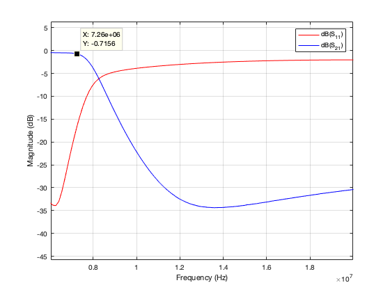
I’ve written a couple of scripts based on Alex’s work which I think makes using the nanoVNA easier. Both scripts need an edit to configure the serial link to the nanoVNA. You’ll need Alex’s code too.
The first script ajfCalibrate.m calibrates the nanoVNA for a particular sweep on the S11 port. You have to do this before every measurement that changes the sweep values, so you do it a lot. Here’s how it looks in the MATLAB console. The inputs are in italics.
>> ajfCalibrate
connect: Serial-/dev/tty.usbmodem4001
status: open
Sweep start (MHz)? 7
Sweep stop (MHz) ? 7.2
Calibrating...
press RETURN when S11 is open
press RETURN when S11 is shorted
press RETURN when S11 has 50 ohm load
Save [0-4]? 4
close
>>
The second script ajfVSWR.m produces a chart of VSWR against frequency. Most radio hams are happier with this than the LogMag chart preferred by RF designers.
I used ajfVSWR to measure my small transmitting loop tuned to the 40m FT8 frequency. As expected it shows the narrow bandwidth in low VSWR that is the drawback of small transmitting loops.
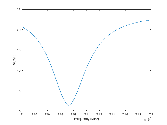
The graph can be zoomed in MATLAB and have data cursors added to show more details.
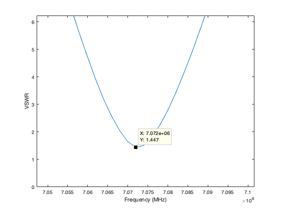
The VSWR could be lower. I think I left a metal step-ladder in the attic which is affecting the loop.
ajf? My initials.
